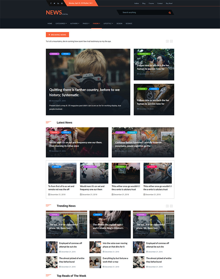
Newsportal HTML Template
When you purchase our theme. You can download Theme files from Downloads page. Navigate through your purchased items.
-
Download your purchased item and you will get the
theme-file.zipinto the theme file. You can use that file for your work. -
Documentation - Contain theme documentation file.
-
Licensing Folder - Contain all licensing info files.
-
development-file. I made this using gulp and scss. If you want to use gulp, you can run.
Free Theme Support
Attention Please
All of our products come with free support and currently we handle all support questions through Our Support Facebook Group [recommended for fast support].
You can also mail us for support electronthemes@gmail.com
Support includes
- Responding to questions or problems regarding the item and its features
- Fixing bugs and reported issues
- Feature Request
- Providing updates to ensure compatibility with new software versions
Item support does not include
- Customization and installation services. ( You can ask paid support )
- Support for third party software and plug-ins
Included Files & Sources
Zenifer
│ Documentation
│ Theme-file
│ │ .html
│ └───assets
    │ │ css
    │ │ fonts
    │ │ img
    │ │ js
Run SASS and Gulp
We developed this theme using scss and gulp. We have included SCSS and gulp file in the theme file. To work with this file, you have to ensure your computer has already installed nodeJS and gulp globally.
- Download NodeJS from here and install
- Install gulp globally
npm install gulp-cli -g - Download sass from here SASS and install
Now check the version of Node, Gulp, sass.
*Node: node -v
*Gulp: gulp -v
*SASS: sass --version
Now to run the theme file, install Node packages. run
npm installnpm run buildnpm run start
Adding new plugins using gulp
You can add new js plugin’s js and css using gulp file. All external css and js files are called in gulpfile.js. You can add new files and run npm run build && npm run start
CSS & Scripts
You will get all css and scripts in the assets folder. CSS files in css folder and JS scripts in js folder. All css and JS plugins file are compressed. I have compressed that for loading fast. If you need uncompressed file, please send us message or mail us. We will send the uncompressed files.
ALL CSS files:
<link rel="stylesheet" type="text/css" href="assets/css/bootstrap.min.css" />
<link rel="stylesheet" type="text/css" href="assets/css/components.css" media="all" />
<link rel="stylesheet" type="text/css" href="assets/css/style.css" media="all">
Script files:
<!-- Jquery scripts -->
<script src="assets/js/plugins-min.js"></script>
Helper classes:
You will get all helper tools here. We have used bootstrap color, backgraound, spacing classes. We made some extra helper classes for best uses.
Color classes:
uses:
<div class="text-primary"></div>
<div class="text-secondary"></div>
<div class="text-white"></div>
<div class="text-heading"></div>
<div class="text-paragraph"></div>
<div class="text-gray"></div>
Reference: text-[value]
value: primary|secondary|white|heading|paragraph|light-gray|gray|light-pink|pink|blue|dimond-blue|red||
Backgraound classes:
uses:
<div class="bg-primary"></div>
<div class="bg-dark-primary"></div>
<div class="bg-secondary"></div>
<div class="bg-white"></div>
<div class="bg-heading"></div>
Reference: bg-[value]
value: primary|secondary|light-black|white|heading|gray|dimond-blue|smoke|deep-purple|purple|light-purple|
Font weight classes:
uses:
<div class="fw-700"></div>
<div class="fw-600"></div>
<div class="fw-500"></div>
Reference: fw-[value]
value: 700|600|500|400|300|
Spacing classes:
Padding classes:
uses:
<div class="pt-10">padding top</div>
<div class="pb-15">padding bottom</div>
<div class="pl-10">padding left</div>
<div class="pr-10">padding right</div>
<div class="px-10">padding left right</div>
<div class="py-10">padding top bottom</div>
Reference: p-[value]
t for top,
b for bottom,
l for left,
r for right,
x for left-right,
y for top-bottom,
value: 10|15|20|25|...|195|200
Margin classes:
uses:
<div class="mt-10">margin top</div>
<div class="mb-15">margin bottom</div>
<div class="ml-10">margin left</div>
<div class="mr-10">margin right</div>
<div class="mx-10">margin left right</div>
<div class="my-10">margin top bottom</div>
Reference: m-[value]
t for top,
b for bottom,
l for left,
r for right,
x for left-right,
y for top-bottom,
value: 10|15|20|25|...|195|200
Media query padding classes
uses:
<div class="pt-xs-10">Extra small devices (portrait phones, less than 576px)</div>
<div class="pb-sm-10">Small devices (landscape phones, 576px and up)</div>
<div class="pl-md-10"> Medium devices (tablets, 768px and up)</div>
<div class="pr-lg-10">Large devices (desktops, 992px and up)</div>
<div class="px-xl-10">Extra large devices (large desktops, 1200px and up)</div>
Reference: p-[size]-[value]
size: xs|sm|md|lg|xl|
value: 10|15|20|25|...|195|200
Media query margin classes
uses:
<div class="mt-xs-10">Extra small devices (portrait phones, less than 576px)</div>
<div class="mb-sm-10">Small devices (landscape phones, 576px and up)</div>
<div class="ml-md-10"> Medium devices (tablets, 768px and up)</div>
<div class="mr-lg-10">Large devices (desktops, 992px and up)</div>
<div class="mx-xl-10">Extra large devices (large desktops, 1200px and up)</div>
Reference: m-[size]-[value]
size: xs|sm|md|lg|xl|
value: 10|15|20|25|...|195|200
Width classes
uses:
<div class="width-10"></div>
<div class="width-20"></div>
<div class="width-30"></div>
Reference: width-[value]
value: 10|20|30|40|...|190|200
Max-width classes
uses:
<div class="maxw-50"></div>
<div class="maxw-100"></div>
<div class="maxw-150"></div>
Reference: maxw-[value]
value: 50|100|150|...|1050|1100
Height classes
uses:
<div class="height-10"></div>
<div class="height-20"></div>
<div class="height-30"></div>
Reference: height-[value]
value: 10|20|30|40|...|190|200
Max-height classes
uses:
<div class="maxh-10"></div>
<div class="maxh-20"></div>
<div class="maxh-30"></div>
Reference: maxh-[value]
value: 10|20|30|40|...|390|400
Instagram feed changing
You can change your instagram feed after only changing with your username of instragram. Change instagram username from scripts.js file.
uses:
$.instagramFeed({
    'username': 'electronthemes', // change only username of your instagram
    'container': ".instagram-gallary",
    'items': 6,
    'display_gallery': true,
    'styling': true,
    'items_per_row': 3,
    margin: '1'
});
Source & Credits
Images
All images are only for demonstration purpose, however you can re-download them in sites below. Almost all (not including overclothing.com, Daniel Zenda, Freepik etc…) images are released free of copyrights under Creative Commons CC0.
CSS & Fonts
Use this CSS & fonts reference you can update css & fonts to customize your design.
- Bootstrap Framework
- Bootstrap-select
- Font Awesome
- Google Fonts
- ElegantIcons
- Flipclock
- Owl Carousel v2.3.4
- Slicknav
- Aos Animation
- Animation
Scripts
Use this jquery scripts reference you can update jquery to modify your design.
- jQuery
- jquery-migrate
- Bootstrap
- Popper
- Bootstrap-select
- Owl Carousel v2.3.4
- Magnific Popup
- Flipclock
- Slicknav
Don’t forget to add 5 star rates on our product
⭐⭐⭐⭐⭐
